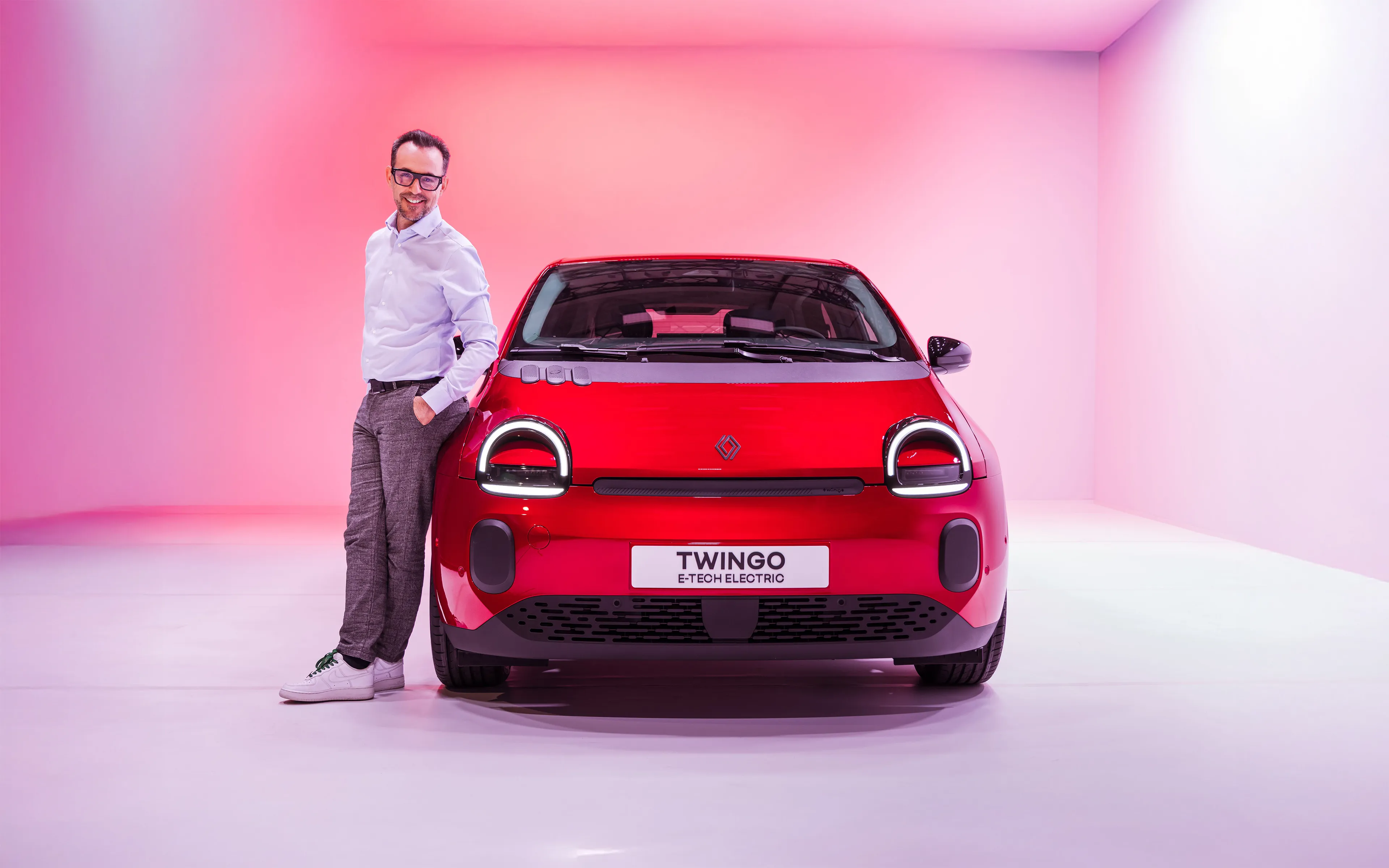
Twingo, the smiley on wheels, has been lighting up cities with its smile since 1993. But did you know that it now has its own typeface, an alphabet created by Renault Design to accompany the fourth incarnation of the small city car? From A to Z, here is a look back at this little-known aspect of the Twingo saga.
Key takeaways
Twingo is enriching its visual identity with a dedicated alphabet, inspired by the spirit of the original Twingo and designed as an extension of its visual universe.
The WINK typeface draws in particular on the codes of 1990s video games, creating a playful and instantly recognizable typographic language.
This emotional design approach strengthens attachment to the brand by multiplying graphic nods inside and outside the vehicle.
More than a city car, Twingo E-Tech electric confirms its status as an emblematic and iconic vehicle thanks to a coherent graphic identity that extends all the way to its merchandise.
Emotional design as a driving force
When it was launched in 1993, Twingo made automotive history with its monovolume design and generous interior space. Its rounded shapes, large expressive headlights and smiling face broke away from the more rational and angular style of the 1980s. With its emotional design and its slogan, “It’s up to you to invent the life that goes with it,” Twingo was conceived not only as an economical means of transport, but as a practical, joyful and friendly everyday object. Its specific monogram and its communications universe at launch helped make it a cult car.
Today, Twingo continues its journey with a modern and committed reinterpretation, Twingo E-Tech electric. True to its original playful and offbeat spirit, Twingo is back—this time with its own typeface.
“The Twingo logo stood out within the Renault range and the automotive landscape of its time, with its rounded, playful, handwritten-style typography.
For the new Twingo, as a true nod to its predecessor, it was obvious to me that it should also have a distinctive, strong and friendly identity. Very quickly, I wanted to go one step further by creating its own custom typeface to strengthen its unique territory of expression.
The objective was to extend the emotional design approach, capable of fostering a sense of connection and complicity between Twingo and its user.”
A typographic design that evokes the gaming universe
How could an identity be created that was anchored in our time while also stirring our emotions through a reminiscence of the past?
Drawing inspiration from the 1990s and the rise of video game consoles, the creative work quickly gravitated toward a graphic language based on pictograms that would immediately speak to everyone—the circle, the triangle, the square. “The idea was that with this new Twingo, we would be able to start a new game, to reinvent a life to go with it,” explains François Blanchard.
This “typographic design” approach is already expressed in the vehicle’s new logo. If you look more closely at the Twingo monogram as it appears on the rear of the car, the T evokes the directional cross on a video game controller, the N echoes the shape of the headlight, while the G recalls the geolocation symbol used on digital maps.
Through the visual references of this expressive typeface, Twingo establishes itself as a true contemporary automotive emblem, faithful to the “joyful and optimistic car” spirit of the Twingo saga.
From graphic logo to text messages
In addition to the graphic variations of this lettering on decorative parts and accessories, the typeface, called “WINK” in reference to Twingo’s gaze and its iconic headlights, can be seen throughout the car’s interior. When the tailgate is opened, for example, the words “open-minded” can be read. The famous slogan “it’s up to you to invent the life that goes with it” also appears on the straps used to slide the rear seats. Finally, the door sills feature suggestions for simple life moments to enjoy with your Twingo. These small graphic winks placed throughout the car contribute to Twingo’s poetic charm.
A typeface that creates a complete customer experience
Twingo’s graphic identity also extends to merchandising, with a fun and modern collection that remains true to Twingo’s pop and mischievous spirit. Bold, expressive and uninhibited, the collection focuses on color, fun and everyday objects that bring the Twingo spirit to life, from the office to weekend getaways. Must-have items include the Twingo velvet cap, Twingo sneakers, the Twingo glass in partnership with Duralex, and the Twingo notebook, so no good idea is ever forgotten.
A total look that adds to the already strong identity of this emblematic car and helps strengthen the emotional attachment of all Twingo lovers to the urban frog.
FAQ
The Twingo logo uses lettering designed specifically for the model, called WINK. It is not a standard commercially available typeface; it is a proprietary Renault logotype.