Who doesn’t immediately think of Renault when they see a diamond? And with good reason! This geometric shape has embodied the brand through its logo since 1925. And it’s not about to change! Proof of this is the new variation unveiled last January and deployed a few days ago. Gilles Vidal, Renault Design Director, reveals why and how this new logo came into being.
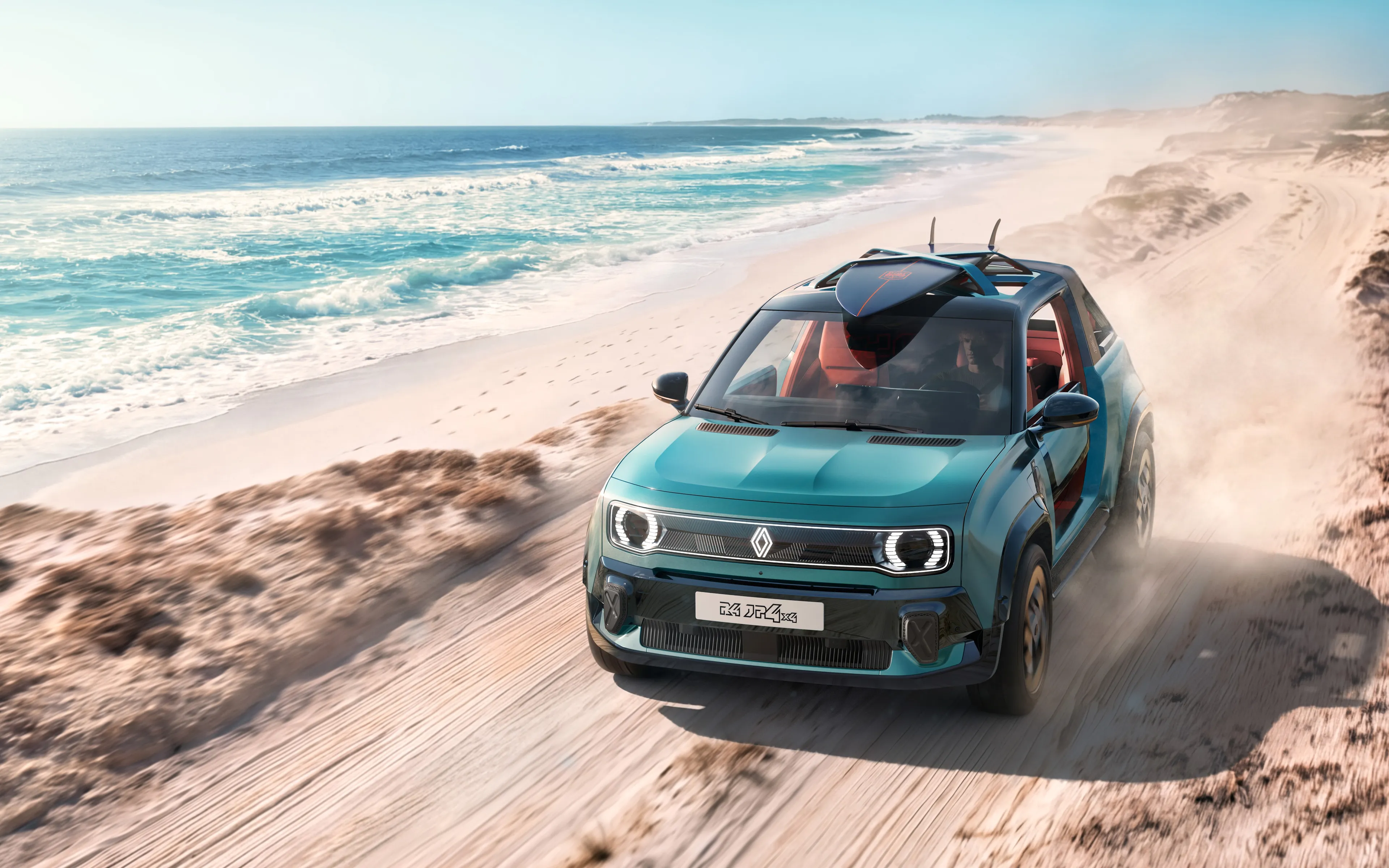
It hasn't escaped anyone's attention. When the Renaulution plan was announced, a new Renault diamond was proudly displayed behind Luca de Meo, CEO of Renault, as well as on the grille of the Renault 5 Prototype. Since then, this new symbol has been unfolding gradually, without any fanfare. First with the new ZOE advertising campaign, then on the brand's social networks. A launch that is meant to be frugal but effective.
The diamond is one of the most recognized shapes in the world and in the world of the automobile. It is a simple geometric shape, with a strong, powerful identity; the challenge was to renew this shape by giving it meaning, new, contemporary values to project the brand into the future.n
A new logo to propel the brand into a new era
Over the course of its history, Renault has changed its visual identity several times. But there is one thing that hasn't changed since 1925, and that is the diamond shape that serves as the basis for the logo. Immediately recognizable, it has become emblematic of the brand. With its angles, which adapted to the angled bonnets of the time, this geometric figure had imposed itself on Louis Renault. Since then, the Renault diamond has been redesigned no less than eight times! Nine, with the latest version. This shows how much the brand is keen to evolve with the times.
Created in 1992, although redesigned in 2015, the latest version of the Renault emblem was beginning to date. To meet the challenges of a modern international brand, but also the multiplicity of its fields of expression, notably digital, a new version was under study since 2019, explains Gilles Vidal. "A balance between recognition of the brand's heritage and entering a new era, symbol of the future", the recently revealed logo, more modern and vibrant, aims to go beyond the notoriety now acquired. The goal? "To accompany the changes currently at work" and to make Renault a more open brand that creates human values.
In tune with the times and resolutely modern, the restyled diamond perfectly embodies the ‘New Wave’ era that Renault has entered
It was therefore naturally unveiled during the presentation of the Renaulution strategic plan and integrated on the grille of the Renault 5 Prototype. The glowing reception it received convinced the brand's management to officially launch it as the new logo. "We have integrated it on the Renault 5 Prototype for the first time. It was for us a formidable testing ground. In view of the enthusiasm and the very positive feedback we received about the logo, we decided to launch it,” said Gilles Vidal.
An even more iconic diamond
For Gilles Vidal, the diamond fundamentally embodies Renault. To preserve this universal geometric shape was an obvious choice. "We have rethought it to become more iconic, simple and meaningful, a true timeless signature, without superfluous effects or colors, with a contemporary takeover of the lines, an essential part of our graphic heritage," he explains. Renault has already used the line to iconize its logo. In 1946, 1959 and 1972. But, far from giving into any fashion, Gilles Vidal explains that "with the line, it is a question of telling a story, that of a symbiosis, a cycle, a path between two lozenges which are intertwined by an optical effect, creating a complementarity and the impression of continuous movement."More than the treatment, it is the drawing, which is highly characterized, that is remarkable.Uncluttered, with no signature or typography, this new logo has been designed to live in movement. The flat treatment facilitates its animation, for example on video or digital media, but also on vehicles, for their welcome sequence. This new logo will be gradually applied to Renault vehicles. It will proudly appear on those to be launched next year. "By 2024, the entire Renault range will carry this new emblem," concludes Gilles Vidal.